Finite Math Class - Endless Exploration and Integration
Exponential Growth is the first unit of study of the senior “Finite Math” class at Frisch. The phrase “exponential growth” is also the best way to describe the first semester of this popular senior math course. Ever since it was initiated in 2011 by Mrs. Sabrina Bernath, Chair of the Math Department, it has been rapidly gathering momentum and providing students with an ever-growing curriculum of real-world topics in mathematics. Teachers Mrs. Chanie Schlesinger and Mrs. Shira Teichman have been teaching parallel Finite Math classes for the past couple of years. Recently they have tweaked the robust Statistics Unit which introduces seniors to topics like Normal Distribution, summation notation, and Z-scores - topics which they will definitely encounter and perhaps explore more in depth in higher education.
The unit began with an exploration of the “Normal Bell Curve” and data that is said to be "normally distributed" (i.e. certain percentages of the data fall in distinct intervals in the bell curve surrounding the data’s mean/average). After thorough study of this topic, Mrs. Schlesinger and Mrs. Teichman wrapped up the unit by having each of the students in their respective classes collect data from the entire senior grade, analyze the data sets, and compare the findings to a "normal distribution". Students from Mrs. Schlesinger’s class entered their grade-mates’ heights in a shared Google Spreadsheet, while students from Mrs. Teichman’s class entered their grade-mates’ shoe sizes in an identical Sheet. The students then found the mean and standard deviation of their class’s respective data, and set about to construct their own Bell Curve. 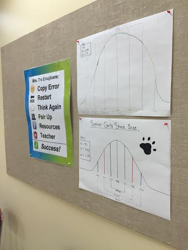
“We anticipate having great discussions about things like sample size versus total population, and data which is skewed by outliers,” Mrs. Teichman emailed Mrs. Bernath a day before the class drew the Bell Curve. In fact, the data did not abide by the general distributions in normally distributed data; each of the classes discussed why this occurred and found it interesting to learn that their grade was so “not normal,” at least when it came to some of their physical characteristics. This was Phase One in a two-phase project designed by Mrs. Schlesinger, and the goal of this phase was to not only provide the students with an understanding of normal distributions, but also to give them an opportunity to collect, analyze, make predictions, compare, and present findings about real and relevant data.
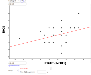
Phase Two of this project came a couple of weeks later. The two Finite Math classes spent several days learning about Non-Linear Regression Analysis which analyzes the relationship - as seen in the correlation coefficient - between two sets of data (bivariate data) when studied together. The teachers had deliberately chosen to analyze shoe sizes and heights in the prior unit, because these usually have a strong correlation. Using the data collected by their students, the teachers combined the lists and created a Scatterplot to show the strong linear relationship between shoe sizes and heights. They then wrote a more detailed analysis, including a prediction about data that was not among the original bivariate data.
Students were amazed to see the link between the data they had gathered as separate classes weeks before. Capitalizing on the students’ enthusiasm, Mrs. Schlesinger and Mrs. Teichman challenged students to work with a partner and analyze their OWN choice of bivariate data to find out how closely linked they are, if at all. Bivariate data sets ranged from "number of friends on Facebook vs. number of Likes on one's profile picture" to "age vs. number of hours of sleep" to “dash time of vs. speed of top projected wide-receiver.”
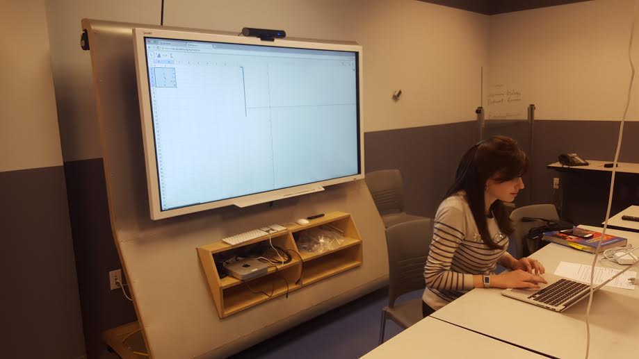
It was then time to curate the data and create a Scatterplot, just as the teachers had done. The best place to work on this final aspect of the project was in the Smedra 21st Century Computer Lab, where students used a powerful program called Geogebra to enter their data values, plot points in a Scatterplot, graph the Line of Best Fit, and determine the correlation coefficient to confirm their initial predictions. It was a phenomenal opportunity for the students to analyze Statistics about truly relevant data, and see it come to life in a view other than on the standard graphing calculator. 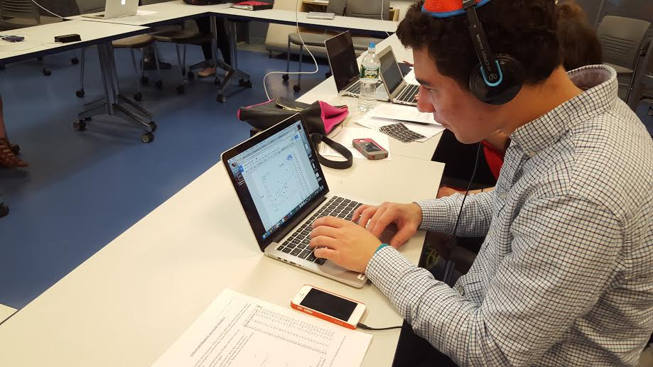
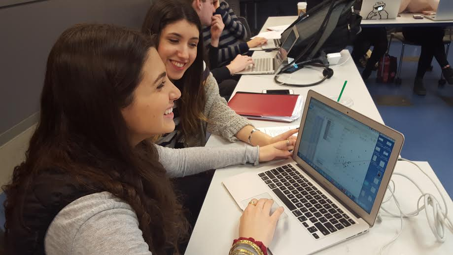
The beauty of this particular unit was the teacher's ability to make the Statistics come to life through visual representations and make the math more meaningful and hands-on through group projects. While this first run-through was extremely exciting, the teachers are already thinking of ways to refine it for the upcoming year.